
Why Roku’s iconic home screen finally got a reboot
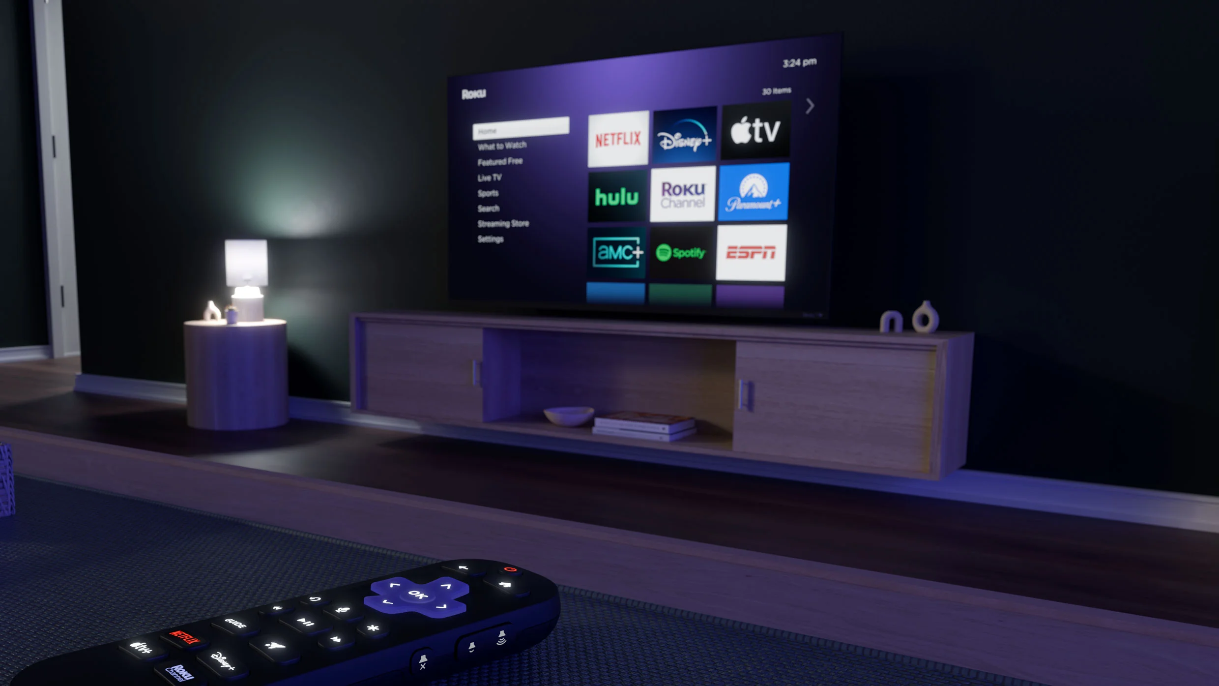
# Roku's Home Screen Gets Its First Major Makeover in 13 Years Roku is redesigning its home screen for the first time since 2011, moving away from the simple grid of app icons that longtime users know to a layout that shows TV and movie recommendations right at the top. The change helps Roku make more money by promoting its own services and ads, while also genuinely solving a frustration for viewers who've gotten tired of scrolling through endless app tiles to find something to watch. The new design rolls out gradually in the U.S. starting this week.
For the 100 million homes that currently use a Roku TV or streaming player, things are about to look a lot different. This week, Roku is rolling out a major redesign of its home screen, replacing the grid of static app tiles that has defined the platform for the past 13 years. The new design puts
More from Make Money with AI


Get new guides every week
Real AI income strategies, tool reviews, and plain-English news — free in your inbox.